KPN Flex & Boost Claim handling

High cognitive load
Users had to understand complex rules, limits, and requirements before taking action.
2
The experience was page-based and fragmented. Users had to figure out the next step themselves.
No Guided Flow
Poor System Transparency
Statuses were unclear and users didn’t know what to expect or what to do next.
Problem

The platform operated as a transactional system, not a user-centered experience.
Through analysis of existing flows and interfaces, several systemic issues emerged:
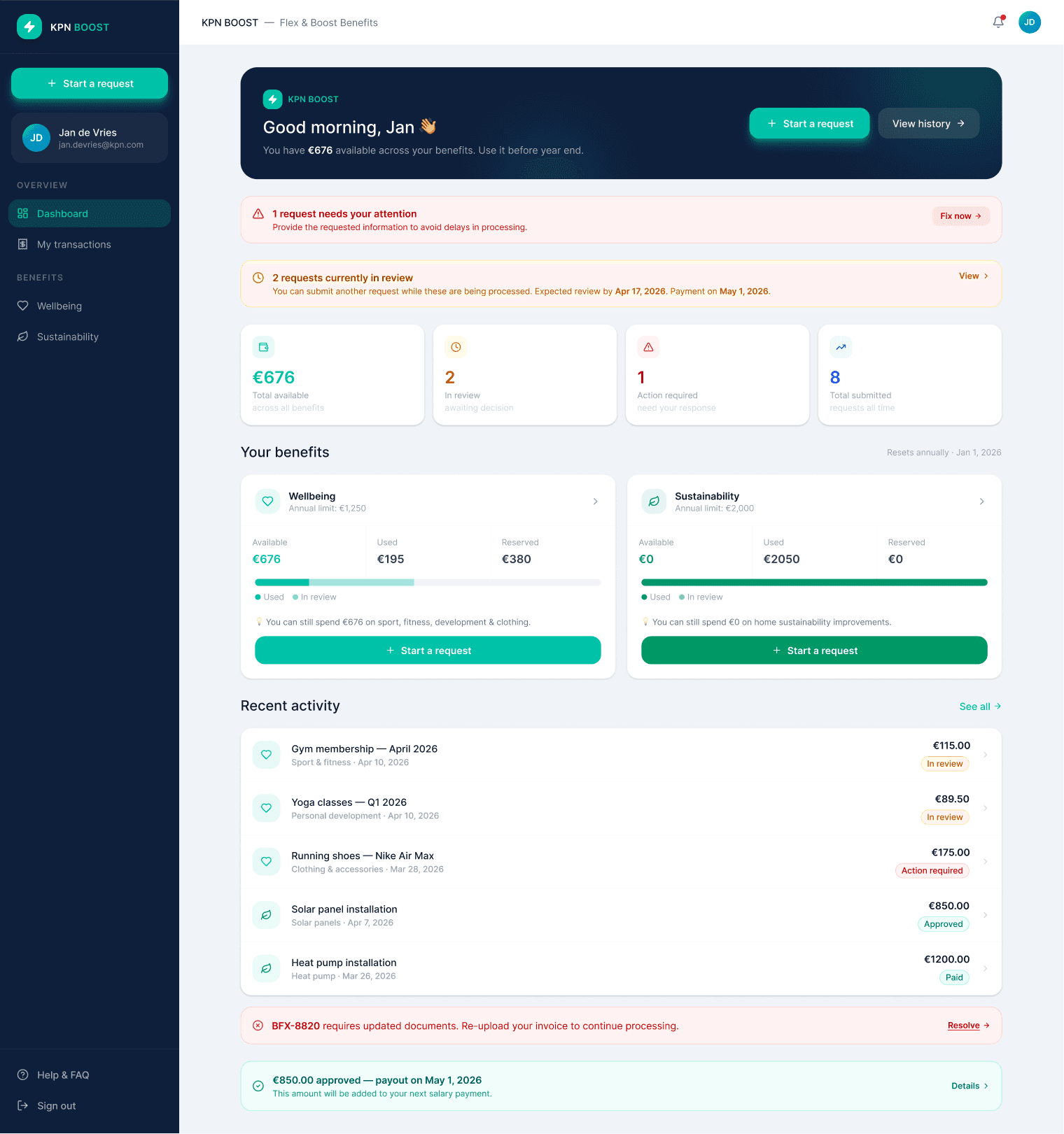
Redesigned Page of the KPN Flex & Boost Platform
Strategy

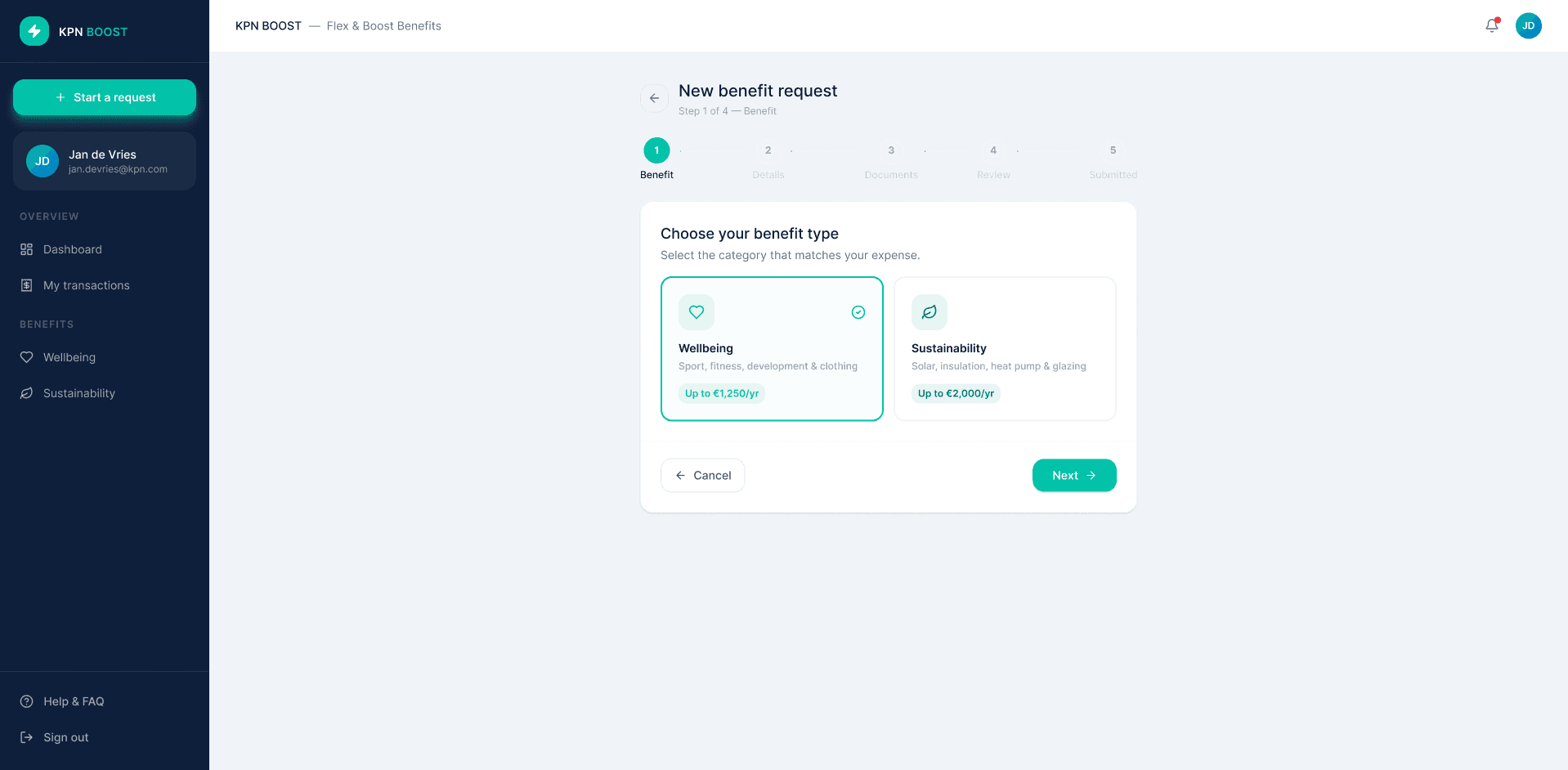
Shift from pages to flows
Introduce a step-by-step journey that guides users from start to finish.
Make rules contextual
Show limits and requirements at the right moment with inline guidance and validation
Turn system state into guidance
Communicate clearly what’s happening, what to expect, and what users can do next.
Icon are from icons8.com & streamlinehq. Mix & Mach library from Lucian popovici.
Overview
KPN Flex & Boost is an employee benefits platform that allows users to allocate budget toward categories such as wellbeing and home sustainability. While functionally complete, the experience was fragmented, rule-heavy, and cognitively demanding.
I led a UX redesign focused on reducing friction, increasing task completion, and making system constraints understandable and actionable.
Impact
Higher task completion
Clear journey and validation reduce drop-off and increase successful submissions.
Fewer errors
Inline validation and document checklist reduce incorrect or incomplete requests.
More trust & transparency
Users understand what's happening and when to expect outcomes.
Reduced cognitive load
Step-by-step flow and contextual guidance make complex rules easier to follow.

Role:Lead Product Designer (Freelance)
Scope: End-to-end UX/UI, Stakeholder management
Redesigning a rule-heavy benefits platform into a guided experiance
Team: HR team, ML engineers, Front-end Developers


Before
Fragmented, rule-heavy experience with no clear path forward
Guided, clear and actionable, users know exactly what to do next
After
Old version of Flex & Boost


Solution - key experience

Clear entry into action
A dashboard that surfaces what matters and makes the next step obvious — no hunting required.
A
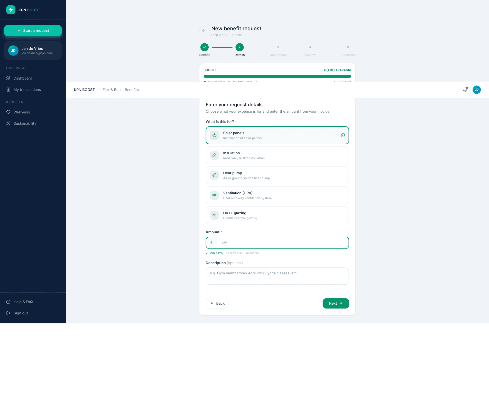
Guided request flow
One step at a time with clear progress indicators and inline guidance.
B
Category
→
→
Amount
Documents
Review
Confirm
→
→
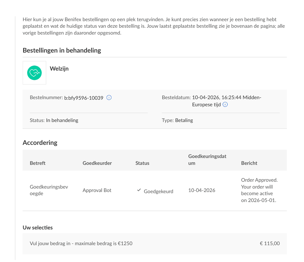
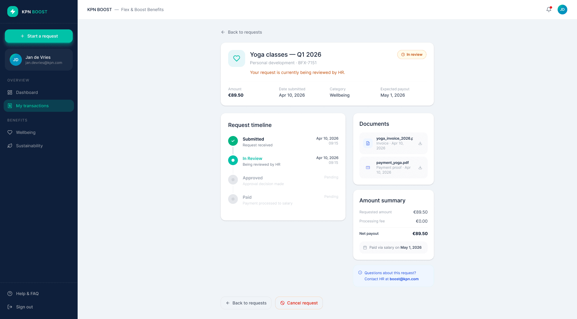
Transparent tracking & feedback
Users always know their request status, timeline, and next steps.
C
Submitted
In review
Approved
Paid
Organised transactions overview
Requests grouped by status with clear actions and full visibility, no ambiguity about what's pending or done.
D
The request flow

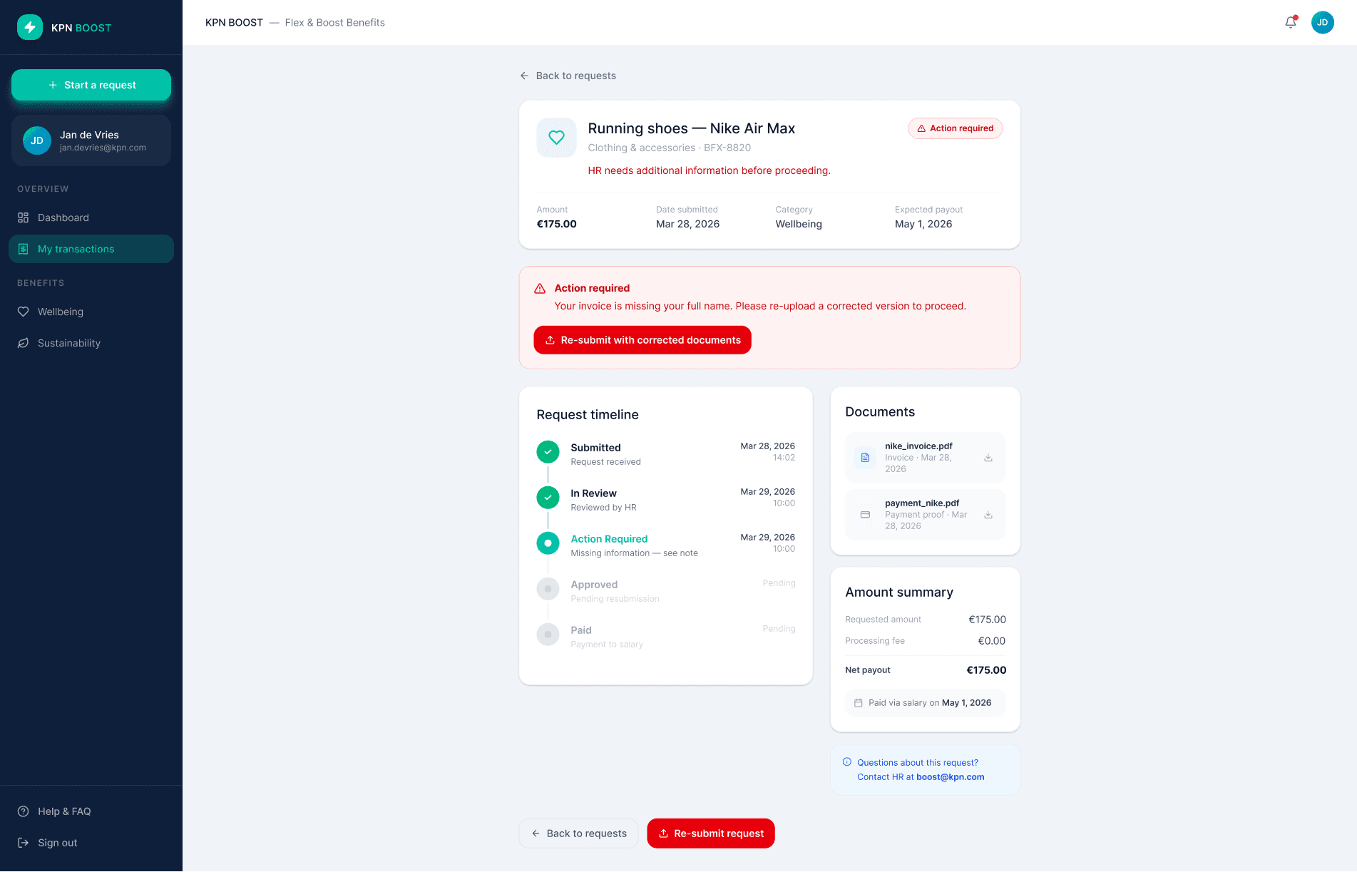
Requests grouped by status with clear actions and full visibility, no ambiguity about what's pending or done.


Task completion
Users completing the full request flow independently, without guidance.
↑ from 12/22
18/22
Round 1
12 / 22
Round 2
18 / 22
Cognitive load
Tracked hesitation, re-reading, and unprompted questions per session.
↓ confusion moments
-4
Round 1
6+ per user
Round 2
fewer than 2
Error rate
Wrong category selections and incomplete uploads dropped between iterations. Users self-corrected less and moved forward with confidence.
Fewer errors
↓
Task completion
Users completing the full request flow independently, without guidance.
↑ from 11/22
19/22
Round 1
11 / 22
Round 2
19/ 22
Method: Two rounds of moderated usability testing with 20 users. Participants completed real tasks, submitting a request, tracking a status, correcting an error, observed without guidance.


Artifacts
Next case study
Teasar__ A two sided marketplace